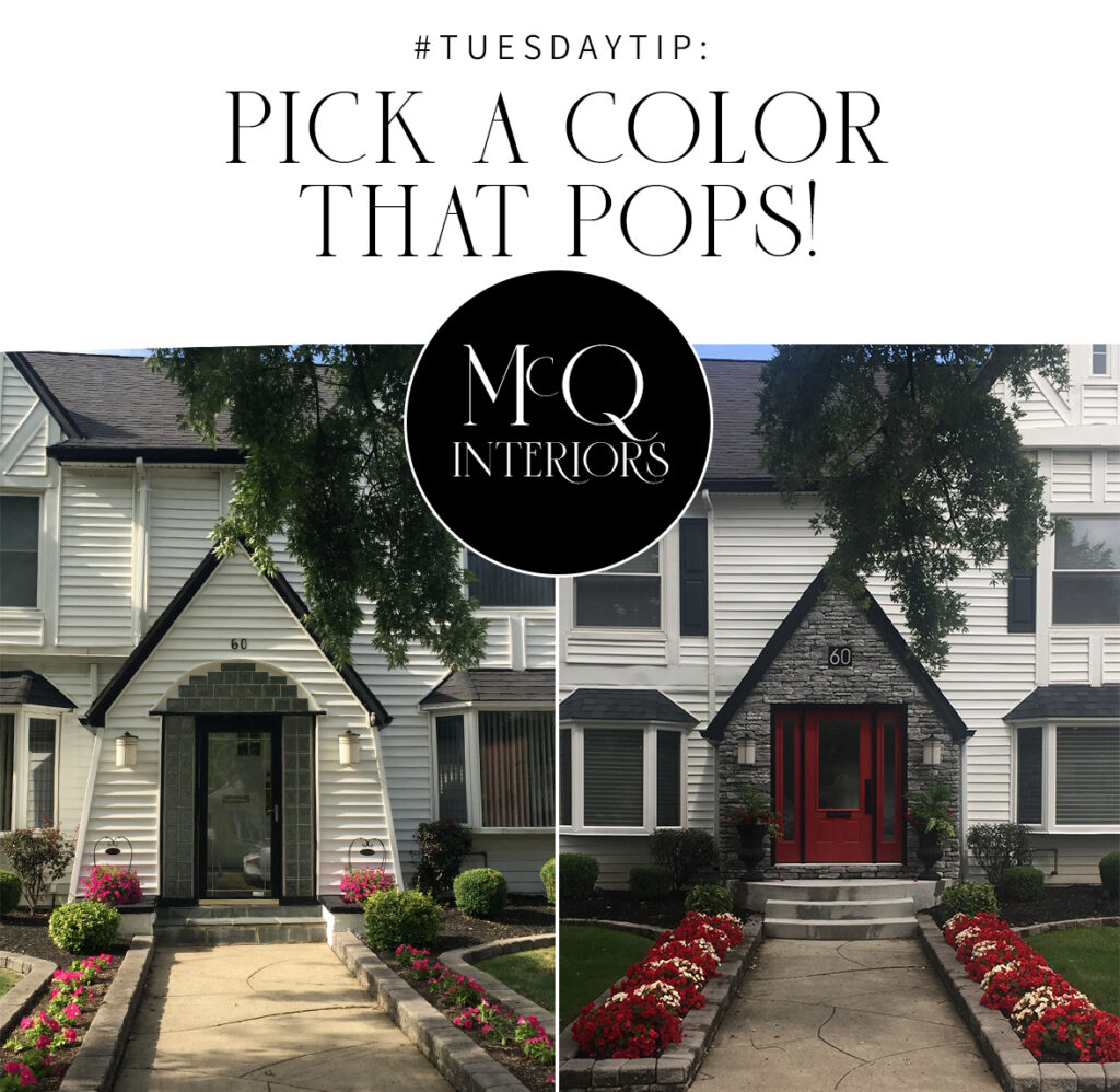
Tuesday Tip: Pick A Color That Pops
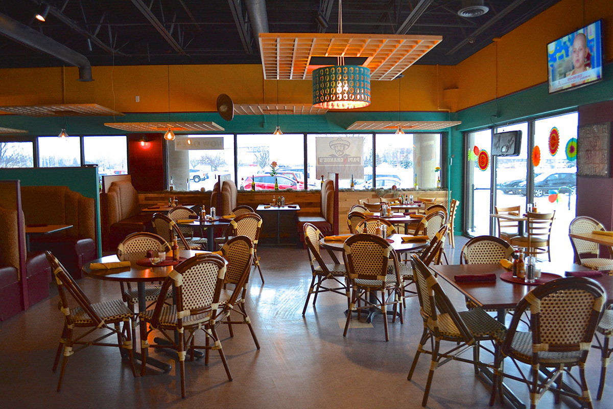
Whether you’re a bar or restaurant trying to create a visual feast to put you ahead of the competition or a homeowner looking to spruce up your interior or exterior, set the “bar” high and pick a paint color that pops!
Not only does incorporating a bright, active color add vibrancy, creativity, and life to your favorite spaces, it also has a stimulating effect to re-energize and lift your spirits (or those of your customers).
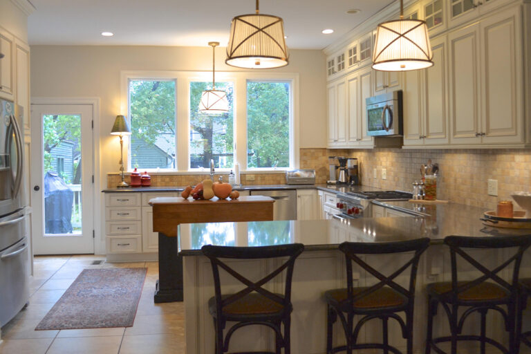
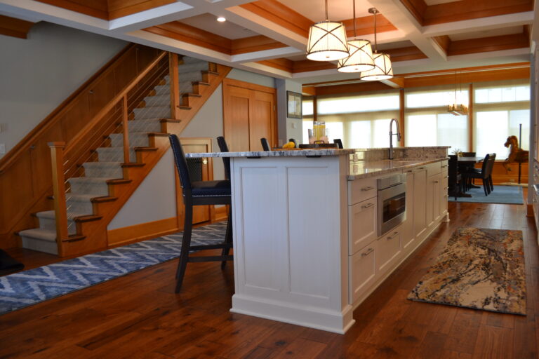
Unless you’re going for a bohemian rainbow scheme, the safest way to add color is to start with just three. Choose passive colors (soft, cool, or pastel shades) for a relaxing, harmonious palette––ideal for bedrooms and bathrooms. Or go bold and pair bright, contrasting tones to liven up a waiting room, kitchen, or accent wall.
For more Interior Design Tips, check out our blog or contact us today to schedule your next consultation!